How to Write Changelog Entries That Users Actually Read

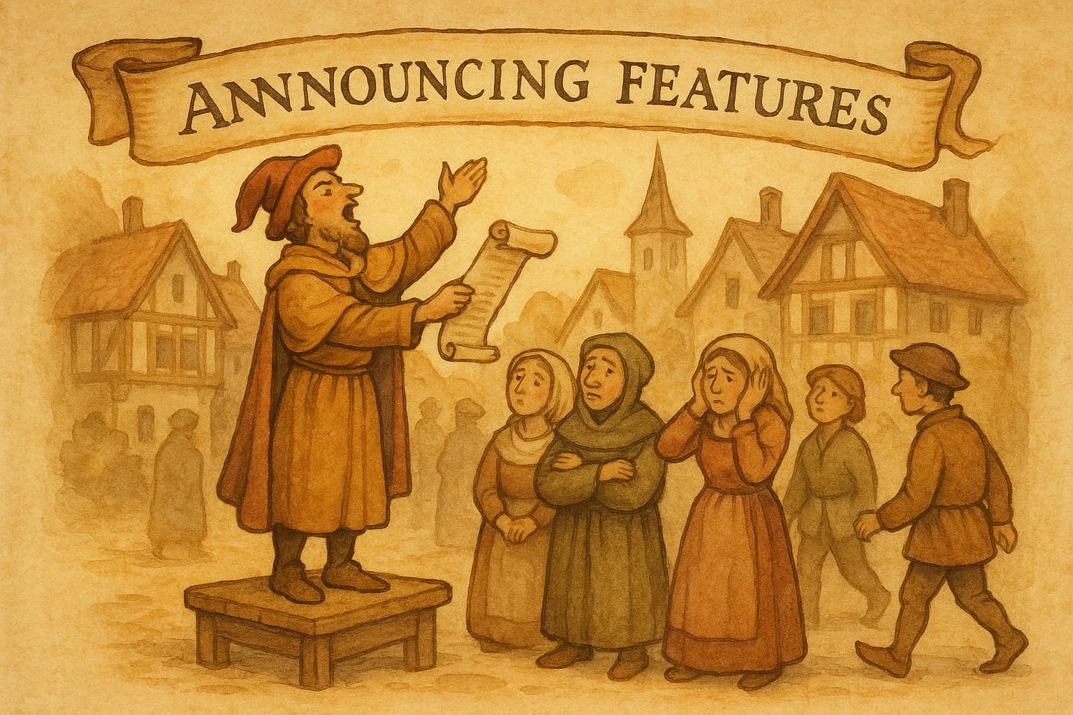
You shipped a great feature. You wrote a changelog entry. Nobody noticed.
Sound familiar? You're not alone. Research shows that 70% of users find release notes "too boring" or "too confusing" to read. Even worse, 60% of users are completely unaware of new features unless they're clearly communicated. That means if your team ships 40 features this year, users might only notice 3 of them.
The problem isn't that users don't care about updates. It's that most changelogs are written for developers, not humans.
This guide will show you how to write changelog entries that actually get read—and drive the feature adoption your work deserves. (If you want the full picture, our complete guide to release notes in 2026 covers templates, examples, and distribution too.)
Why Most Changelogs Fail
Before we fix the problem, let's understand what's broken. Here are the four most common reasons changelogs go unread:
1. Too Technical
Many changelogs read like commit messages because, well, they often are. Entries like "Refactored authentication subsystem for improved token handling" might make sense to the engineer who wrote it, but it means nothing to the user trying to log in.
Your users don't care about your architecture. They care about what they can do now that they couldn't do before.
2. Too Vague
The opposite problem is equally deadly. "Bug fixes and improvements" tells users nothing. Neither does "Various performance enhancements" or "Minor updates."
If a change isn't worth explaining, is it worth mentioning at all? Vague entries train users to ignore your changelog entirely.
3. Hard to Find
72% of developers struggle to locate changelogs, and 58% abandon them because they're hard to navigate. If your changelog is buried three clicks deep in a help center, users won't find it.
The best changelogs live at obvious URLs like /changelog or /updates, are linked from your app's navigation, and are promoted through in-app widgets or email.
4. Walls of Text
A changelog entry shouldn't require a cup of coffee to get through. Without formatting, bullet points, or visual hierarchy, even important updates become invisible.
Studies show that changelogs with images see 50% higher click-through rates to feature documentation, and visuals improve comprehension by 67%. Yet most changelogs are plain text.
The Golden Rule: Write for Humans, Not Machines
The "Keep a Changelog" standard—the closest thing to an industry standard we have—opens with this principle: Changelogs are for humans, not machines.
This means:
- Don't dump git logs into your changelog
- Don't write for your fellow engineers
- Don't assume technical knowledge
Instead, answer one simple question for every entry: "What's in it for the user?"
Here's what that looks like in practice:
| Before (Technical) | After (Human) |
|---|---|
| Refactored authentication subsystem | Sign-in is now 2x faster |
| Added new automation triggers | You can now schedule automated check-ins—no more manual reminders |
| Fixed bug in payment processing | Credit card payments now process correctly on first attempt |
| Optimized database queries | Dashboard loads 3x faster |
Notice the pattern? The "after" versions focus on outcomes, not implementation. They answer "so what?" before the user has to ask.
A Simple Structure That Works
You don't need to reinvent the wheel. The most effective changelogs follow a consistent structure that makes scanning easy:
The Template
Here's a simple structure you can copy and adapt:
Version 2.4.0 — January 23, 2026
Added
- Team collaboration: Invite teammates to your workspace and collaborate on updates in real-time
- Slack integration: Get notified in Slack when new updates are published
Improved
- Dashboard now loads 3x faster on slow connections
- Search results are more relevant with improved fuzzy matching
Fixed
- Images no longer break when pasted from certain email clients
- Export to PDF now includes all pages, not just the first one
Why This Works
Version numbers and dates make it easy to track changes over time and reference specific releases.
Consistent categories (Added, Improved, Fixed) let users quickly find what they care about. Someone looking for bug fixes can skip straight to "Fixed." Someone excited about new features can focus on "Added."
Bullet points make entries scannable. One idea per bullet. Short sentences.
Bold text for key features helps important updates stand out even when skimming.
How to Write Entries That Get Read
Structure is the foundation, but the words matter too. Here's how to write individual entries that engage users:
Lead with Value
Start every entry with what the user can now do, not what you built. Compare:
- Weak: "Added new export functionality"
- Strong: "Export your data to CSV, Excel, or PDF with one click"
The strong version immediately communicates value. The user knows exactly what they're getting.
Be Specific
Vague claims feel like marketing fluff. Specific claims feel like real improvements:
- Vague: "Improved performance"
- Specific: "Pages now load in under 2 seconds, down from 8 seconds"
When you have numbers, use them. When you don't, describe the improvement in concrete terms: "Search now finds results as you type" is better than "Improved search experience."
Use Plain Language
Skip the jargon. If your mom couldn't explain the update to a friend, rewrite it.
- Jargon: "Implemented OAuth 2.0 PKCE flow for enhanced security"
- Plain: "Sign in with Google is now more secure—and just as easy"
Technical users can dig into documentation if they want details. Your changelog should be accessible to everyone.
Add Visuals When Possible
A screenshot or GIF is worth a thousand words. For major features, consider including:
- A small screenshot showing the new UI
- A GIF demonstrating the feature in action
- An icon or emoji to make the entry pop
Research shows changelogs with visuals see 50% higher engagement. Even simple formatting like emojis can help:
Added
- 🚀 Instant previews: See your changelog exactly as users will see it
- 📧 Email campaigns: Send updates directly to your subscribers
- 🔗 Linear integration: Import completed tickets with one click
Include a Call to Action
Don't leave users wondering what to do next. For significant features, tell them how to try it:
- "Head to Settings → Integrations to connect your Slack workspace"
- "Try it now: Click the new 'Export' button in your dashboard"
- "Learn more in our quick start guide"
A clear CTA increases feature adoption and reduces support questions.
Examples from Great Changelogs
Let's look at how top companies structure their changelogs:
Linear
Linear's changelog is a masterclass in visual communication. Each entry includes:
- Clear, benefit-focused headlines
- Screenshots or illustrations for every major feature
- Concise descriptions that explain the "why"
- Separate sections for improvements and fixes
They also publish individual entries as they ship, rather than batching everything into version releases. This keeps users engaged and creates a sense of continuous improvement.
Notion
Notion organizes their changelog by release (like "Notion 3.1") with clear dates and themed updates. They group related features together and lead with the most impactful changes. Their entries balance technical detail for power users with accessible language for everyone else.
What They Have in Common
Great changelogs share these traits:
- Prominent placement: Easy to find from the main app
- Consistent formatting: Users know what to expect
- Visual richness: Screenshots, icons, and clear typography
- Benefit-first writing: Focus on outcomes, not implementation
- Regular updates: Fresh content keeps users coming back
The Changelog Checklist
Before you publish your next update, run through this quick checklist:
Format
- Includes version number or date
- Uses consistent categories (Added, Improved, Fixed)
- Bullet points, not paragraphs
- Bold text highlights key features
Content
- Leads with user benefit, not technical detail
- Specific rather than vague ("2x faster" not "improved")
- Plain language (passes the "mom test")
- Includes CTA for major features
Extras
- Screenshot or GIF for major features
- Links to documentation where helpful
- Emoji or icons for visual interest (optional)
Distribution
- Posted to changelog page
- Announced via in-app widget
- Sent to email subscribers (for major updates)
The Payoff: Why This Matters
Getting changelogs right isn't just about polish—it directly impacts your business:
Higher feature adoption: Teams with consistent announcement strategies see up to 4x higher feature adoption. When users know about features, they use them.
Lower support burden: Support tickets drop by 15-30% after thorough changelog rollouts. Users can self-serve when they understand what's available.
Increased engagement: Well-formatted changelogs see engagement rates jump from 8% to 45%+. That's the difference between being ignored and being read.
Customer trust: Regular, transparent updates build trust. Users feel like partners in your product's evolution, not passengers.
Stop Writing, Start Shipping
If writing changelog entries feels like a chore, there's a better way. Modern tools can help you turn completed work into polished updates automatically.
Worknotes connects to your Linear workspace and uses AI to generate professional changelog entries from your completed tickets. Instead of translating developer-speak into user-friendly updates, you review and publish what the AI drafts.
The result? Changelogs that are consistent, well-written, and actually get read—without the writing overhead.
Start your free 14-day trial and see how much easier product updates can be.
A better way to share product updates
Worknotes is a platform for creating and sharing product updates across changelogs, email, and in-app announcements, without slowing down your team.